Designing user access provisioning for an enterprise financial platform
Company name changed under NDA. Fortune 100 US retirement and asset management firm, 2018 to 2024.
Overview
This case study walks through the design of a guided, multi-step provisioning wizard for Apex Platform, a B2B enterprise tool used by plan sponsor administrators to manage employee benefit access.
Over four years I designed the User Management module end to end, from user creation through role assignment, plan and division selection, and final review.
My role beyond UI design
I was the sole designer on this module for the duration of the project, which meant the role extended well past screens. I translated business requirements written by product managers into flows, identified gaps in those requirements before engineering picked them up, and held the line on consistency as the platform's broader design system evolved through several iterations.
The work sat at the intersection of three competing pressures: what the business needed shipped, what the backend systems could support, and what a non-technical administrator could realistically complete without confusion. Most of my decisions were a negotiation between those three.
Key challenges
Provisioning access for a B2B financial platform is a genuinely complex design problem, with real technical depth behind every screen. Below are the central challenges I designed for, pulled directly from the product requirements I worked from.
| Challenge | Solution |
|---|---|
| Clients and relationship managers needed a faster, more modern way to set up new user access than the existing manual process allowed. | I designed a fully digital, guided wizard that let authorized administrators create users and provision access directly inside the platform, giving clients a self-service path end to end. |
| Two different benefits in the same wizard relied on different backend sequencing, plans-then-divisions for most benefits, divisions-then-plans for Stock Plan Services, each rooted in sound product-specific logic. | I designed one consistent wizard shell, including the step structure and progress indication, that could elegantly absorb either sequence without the administrator ever perceiving a difference. |
| Role names and permissions varied meaningfully across benefits, reflecting real differences in what each role could responsibly access. | I embedded plain-language role descriptions directly into the selection step, putting the right context exactly where administrators needed it to make a confident choice. |
| The initial MVP was intentionally scoped to a focused first release, clients without divisions and under eight plans, while the broader client base had richer, more varied configurations. | I designed the flow to scale gracefully from day one, so the same wizard structure built for the MVP could extend naturally to mixed-division, multi-plan scenarios without a redesign. |
Discovery
Before diving into requirements, it is worth zooming out to where this work sits in the administrator's broader task. The Add Access wizard is one stage in a longer journey that starts before the administrator ever opens the platform and continues well after a user is provisioned.
Reading the requirements
The earliest project documentation defined a deliberately narrow MVP. Entry criteria included: the client must already be on the platform's newer roles-based access system, the client must not use divisions, and the client must have fewer than eight plans for the selected benefit. Administrators setting up users as Directing Parties, Third Party users, or Advisors were explicitly out of scope.
This told me two things. First, whatever I designed for the MVP needed a clear, intentional ceiling, since the easy path was deliberately small. Second, the real complexity, divisions, larger plan counts, and third-party relationships, was coming, and the architecture of the wizard needed to anticipate it rather than require a rebuild later.
Key insights from requirements
- The product had two distinct backend role systems running in parallel for years, an older direct-permission model and a newer roles-based model, and the UI had to work for clients on either one.
- Divisional access control was not uniform. Some benefits applied a single division setting across all of a client's plans, others required division settings per individual plan.
- Compliance and audit requirements meant every provisioning action needed a clear record of what was granted, by whom, and under what role, which shaped the entire review and submission step.
Core hypotheses
If administrators see role options described in plain language at the point of selection, then they will make confident, well-informed access grants, since the right context lives exactly where the decision happens rather than in a separate document.
If the wizard's step structure stays visually and structurally identical regardless of which benefit is selected, then administrators will build a reliable mental model of the task, even though Stock Plan Services required reversed backend sequencing.
Usability validation
To test the two core hypotheses, I ran moderated, task-based usability testing with 7 administrators, weighted toward qualitative depth given the platform's low-frequency, high-stakes usage pattern.
Study design
Participants included a mix of frequent and infrequent users, since infrequent users carry the highest risk of confusion in an unfamiliar flow, along with administrators managing more complex client configurations, multiple plans, and mixed division rules, to stress-test beyond the MVP's simpler baseline case.
Key tasks included completing the full Create User flow unassisted, adding access for a straightforward single-benefit case to establish a baseline, then the harder mixed-division scenario where some plans are restricted and others are not. A role-selection task asked participants to explain a role's permissions in their own words immediately after reading its in-flow description, directly testing whether the plain-language content was doing its job. A final task tested the edit-from-review pattern, asking participants to return to an earlier step and revise a decision after reaching the review screen.
What the study confirmed
The plain-language role descriptions worked as intended. Every participant correctly explained their selected role's permissions without hesitation, validating the decision to embed that context directly in the flow rather than in separate documentation. The edit-from-review pattern also performed well, with all participants successfully locating and correcting a prior decision without confusion.
What the study surfaced
The mixed-division task was the one place where the design needed work. In the original version, the binary "restrict by division?" gate applied once per plan, but the per-plan division list that followed reused the same visual treatment regardless of whether a plan was restricted or unrestricted. Three of seven participants briefly hesitated on unrestricted plans, unsure whether the absence of selected divisions meant "no restriction" or "not yet completed."
In response, I added the explicit "No division restrictions, user will access all divisions" label to unrestricted plans, replacing the ambiguous empty state with a clear, confirmed status. The screens in this case study reflect that revised version. A short follow-up check with two of the original participants confirmed the new label resolved the hesitation.
Design solution
The wizard moves through six steps, with the division filtering step branching depending on whether a plan is restricted, before converging back into a single review and submission step.
Design principles
I explored three directions for how the wizard should present multi-step, multi-benefit complexity to a non-technical administrator. The Guided Wizard with Consistent Shell ultimately shipped because it gave administrators a stable structural anchor. The progress bar and step pattern never changed, while the underlying logic flexed per benefit. This balanced predictability with flexibility.
Key design decisions
- Plain-language role descriptions at point of selection. Rather than requiring administrators to consult separate documentation, role permissions are described directly in the selection step, putting the right context exactly where the decision happens.
- Consistent shell with adaptive content. The progress bar, step structure, and buttons remain identical across both standard and Stock Plan Services flows, protecting the administrator's mental model even though the backend logic diverges.
- Explicit empty states in division filtering. When a plan has no division restrictions, we explicitly state "No division restrictions, user will access all divisions" rather than leaving the state ambiguous.
- Compliance built into workflow. Rather than managing access review through external reports or email, the review and attestation screens live inside the platform administrators use daily.
Feature deep dive
The wizard moves through six steps, with the division filtering step branching depending on whether a plan is restricted, before converging back into a single review and submission step. The screens below walk through each step, paired with the specific anti-patterns avoided and UX psychology principles applied.
Creating a user
The first step in granting access is creating the user's record. I designed a two-step flow: user type selection, then a personal information form.
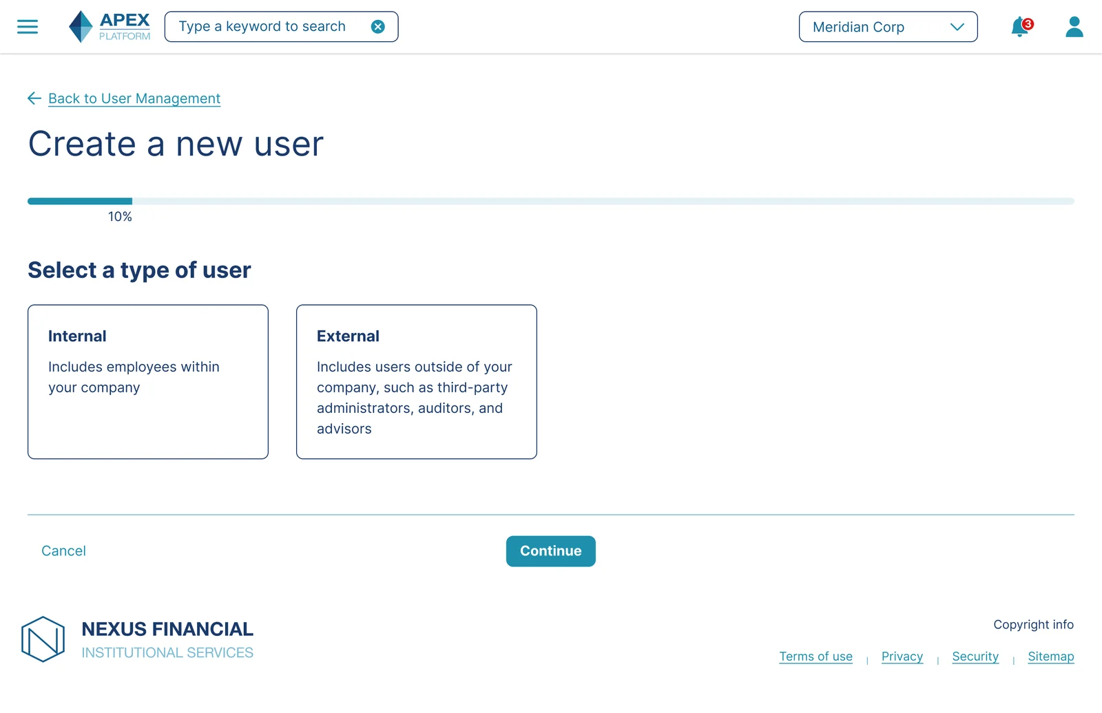
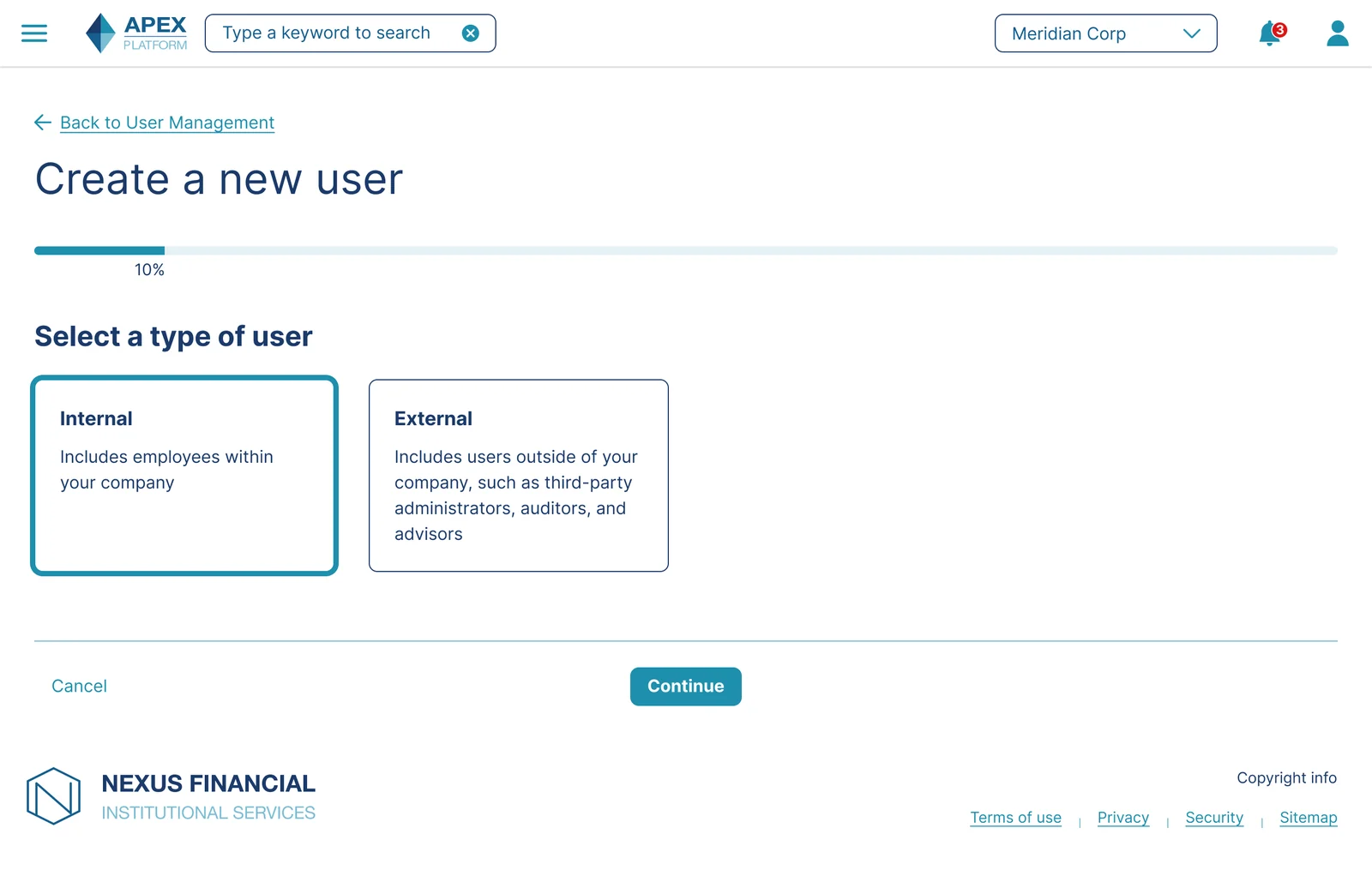
Avoid Hidden Defaults: Rather than pre-selecting a default user type, both options are presented unselected with equal visual weight, forcing an intentional choice rather than letting an administrator accidentally proceed with the wrong type.
Don't Overload the Decision: Only two options are shown at this stage, even though the platform eventually supports more nuanced user classifications, since presenting that complexity before it's relevant would slow down the common case.
Hick's Law: Decision time increases with the number and complexity of choices. Limiting this step to two clearly differentiated options keeps the decision fast, even though the underlying permission system is far more complex.
Recognition Over Recall: Each option includes a short description rather than relying on the administrator to remember what "Internal" or "External" means from a separate document.
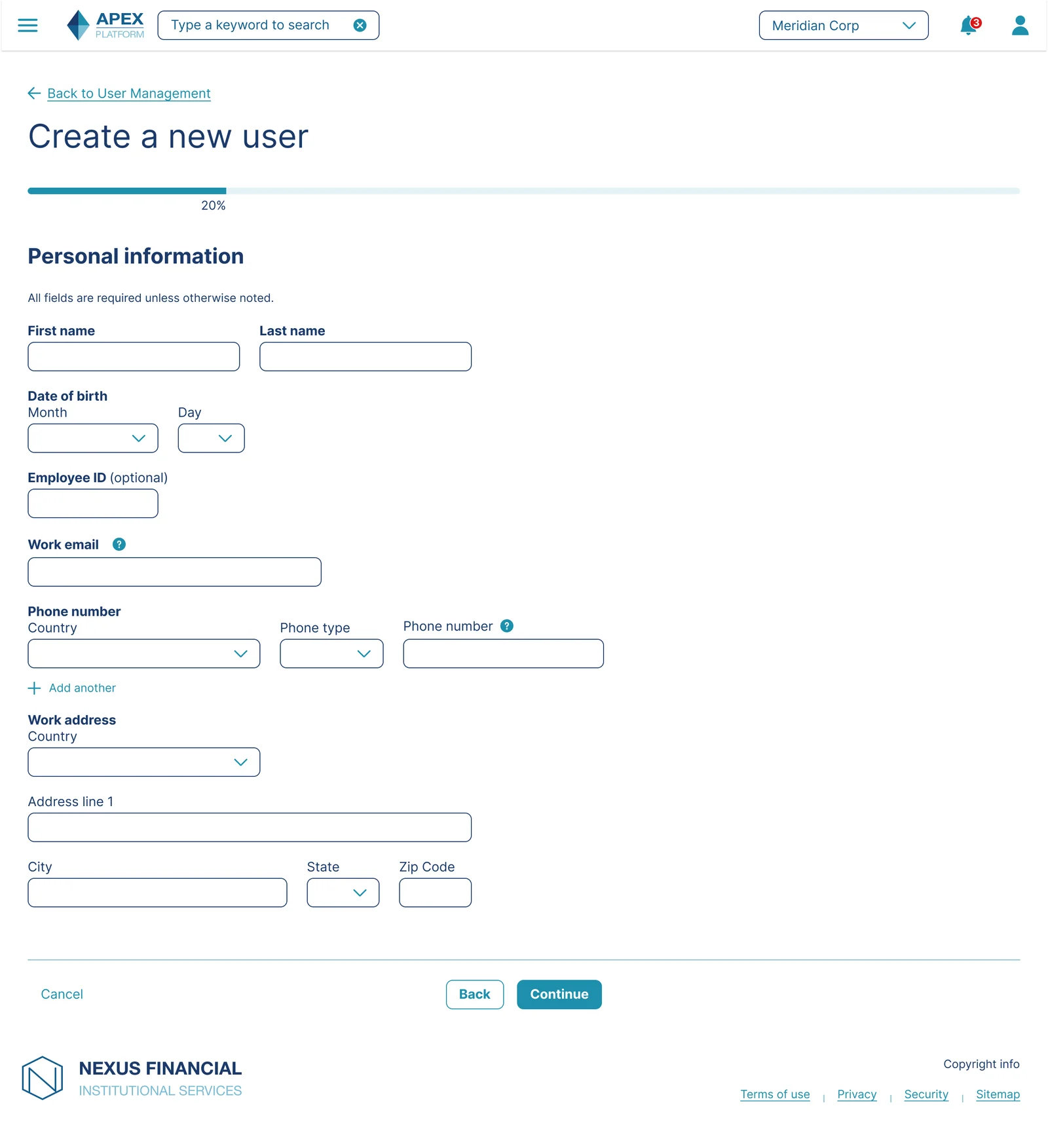
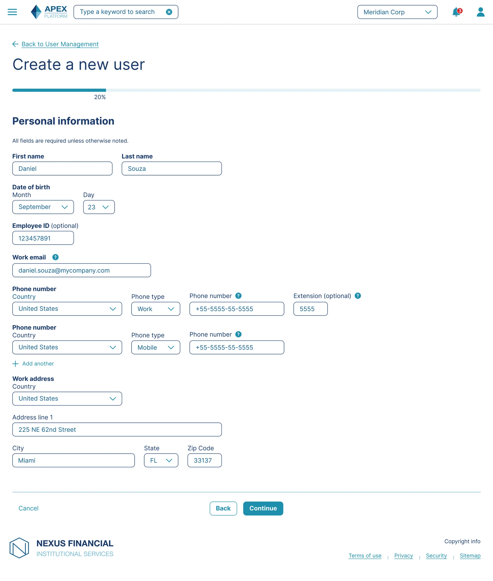
Don't Force Uniform Field Widths: Rather than aligning all fields to a rigid column grid, each field is sized to match the length of its expected content, a phone number field is exactly as wide as a phone number, not as wide as an address line.
Cognitive Load Reduction: A field's width is a visual cue for what kind of input is expected before the user even reads the label. Matching width to content type reduces the small but real mental effort of parsing each field.
Role selection
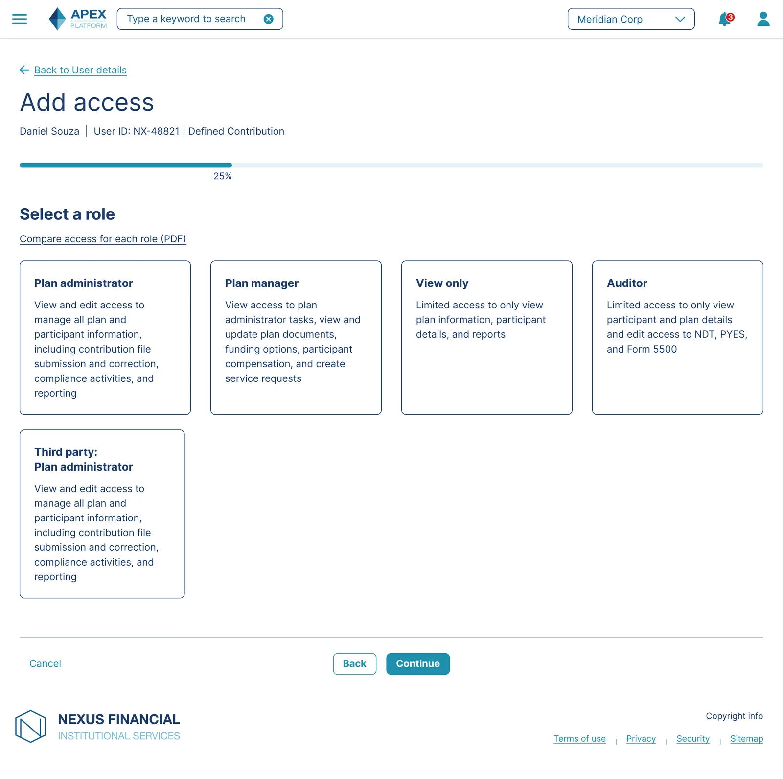
Don't Bury Critical Decisions in Documentation: The legacy experience required consulting a separate PDF to understand role differences. I moved that explanatory content directly into the selection step.
Recognition Over Recall: As above, this is one of the clearest applications of the principle in the whole flow, since selecting the wrong role here was a genuine compliance risk, not just an inconvenience.
Progressive Disclosure: A "Compare roles" link is available for administrators who want more depth, without forcing that detail on everyone by default.
Plan selection
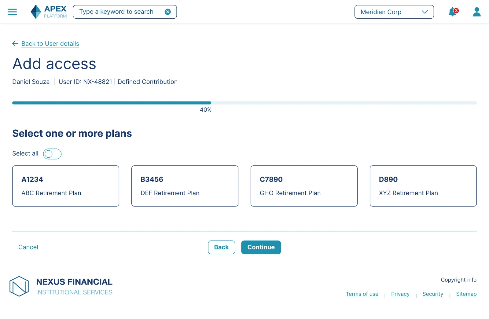
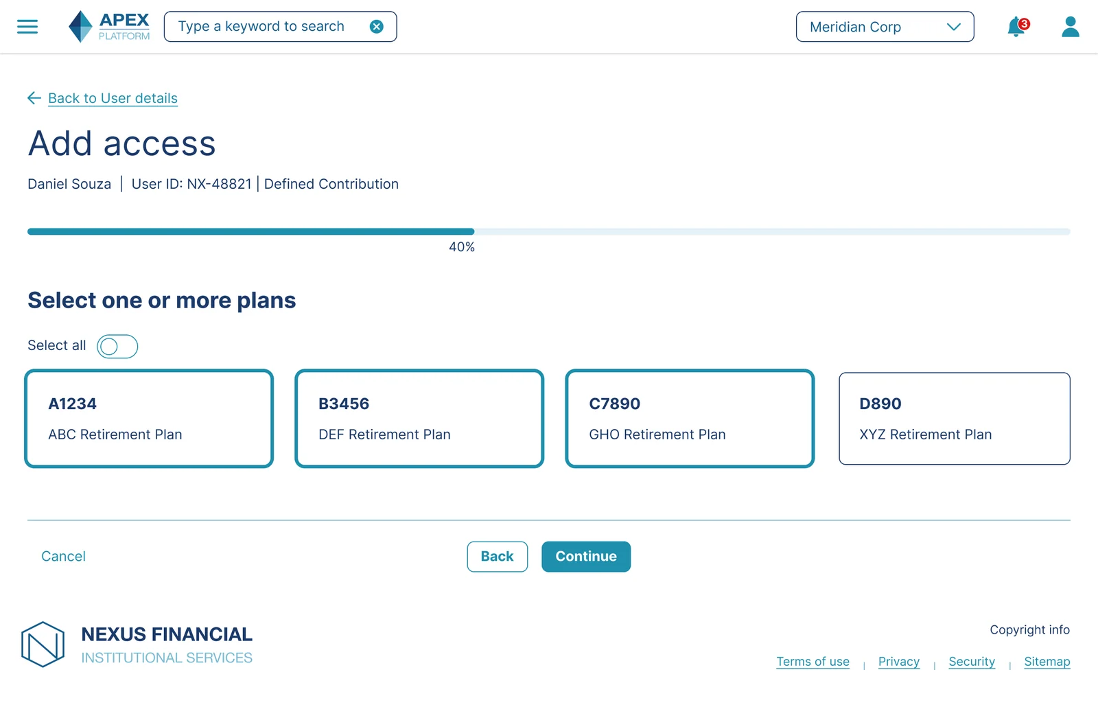
Avoid Forced Sequential Selection for Independent Items: Plans are independent of one another, so I used checkboxes with a select-all shortcut rather than forcing one-at-a-time confirmation, which would have added friction for clients with many plans.
Goal Gradient Effect: The select-all option lets administrators reach a near-complete state quickly, then fine-tune by deselecting, which research on goal-directed behavior shows increases the likelihood of completing the full set of decisions.
Division filtering
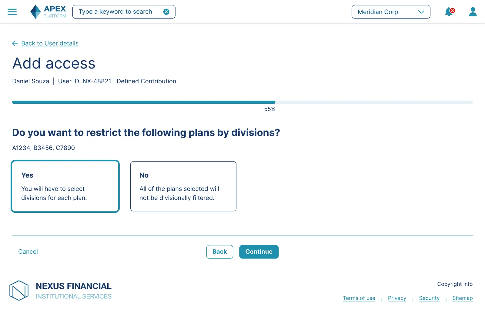
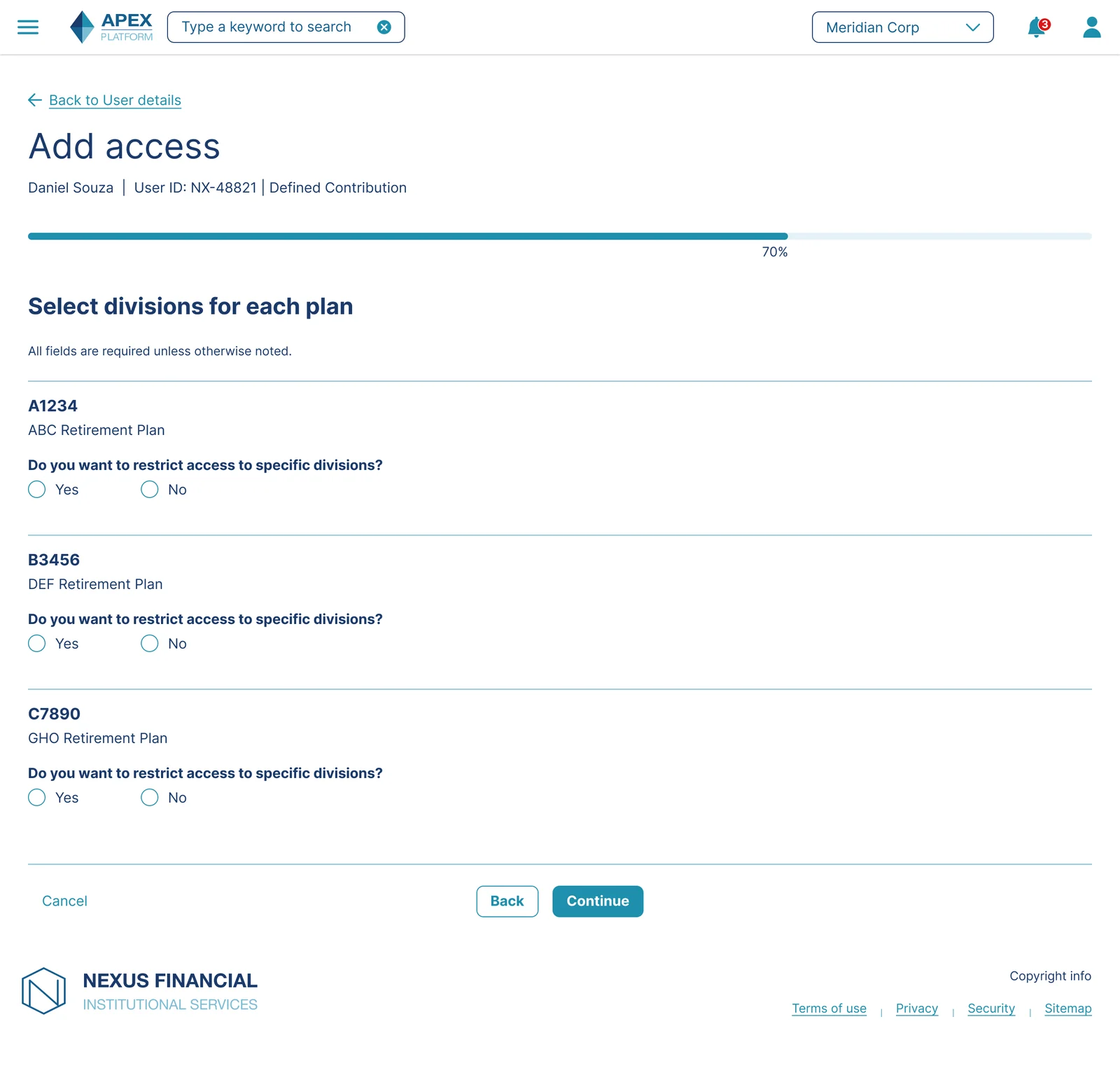
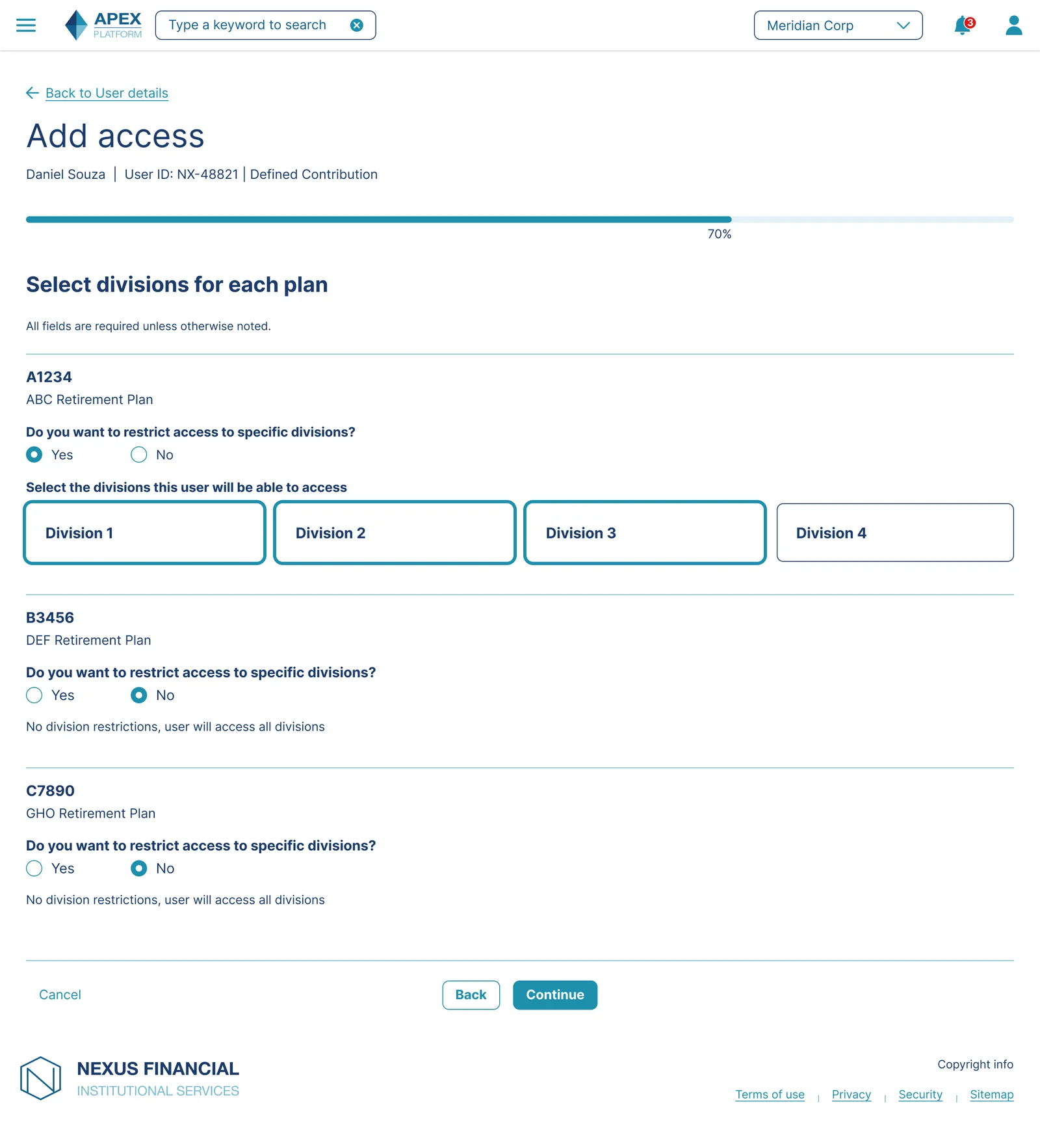
Don't Present Irrelevant Complexity: For clients or plans that don't use divisions, this step is skipped silently rather than shown with a "not applicable" message, which would have added noise to a flow most administrators would see as a non-issue.
Avoid Flattening Genuinely Different Decisions Into One: Rather than asking "select divisions" as a single ambiguous question, I split it into a binary gate, restrict or don't, followed by granular selection only for plans where the answer was yes.
Don't Leave Empty States Ambiguous: Usability testing surfaced hesitation when unrestricted plans showed no selected divisions with no further explanation, since participants couldn't tell if that meant "no restriction" or "incomplete." I added an explicit "No division restrictions, user will access all divisions" label to remove that ambiguity.
Chunking: Breaking the division decision into two smaller, sequential decisions, rather than one large multi-part one, reduces the cognitive load of holding several plan-by-plan decisions in mind at once.
Miller's Law: This step can present several plans simultaneously, each with their own division state. Grouping the binary gate and the detail view as two distinct sub-steps keeps the number of decisions visible at once within a manageable range.
Review and submit
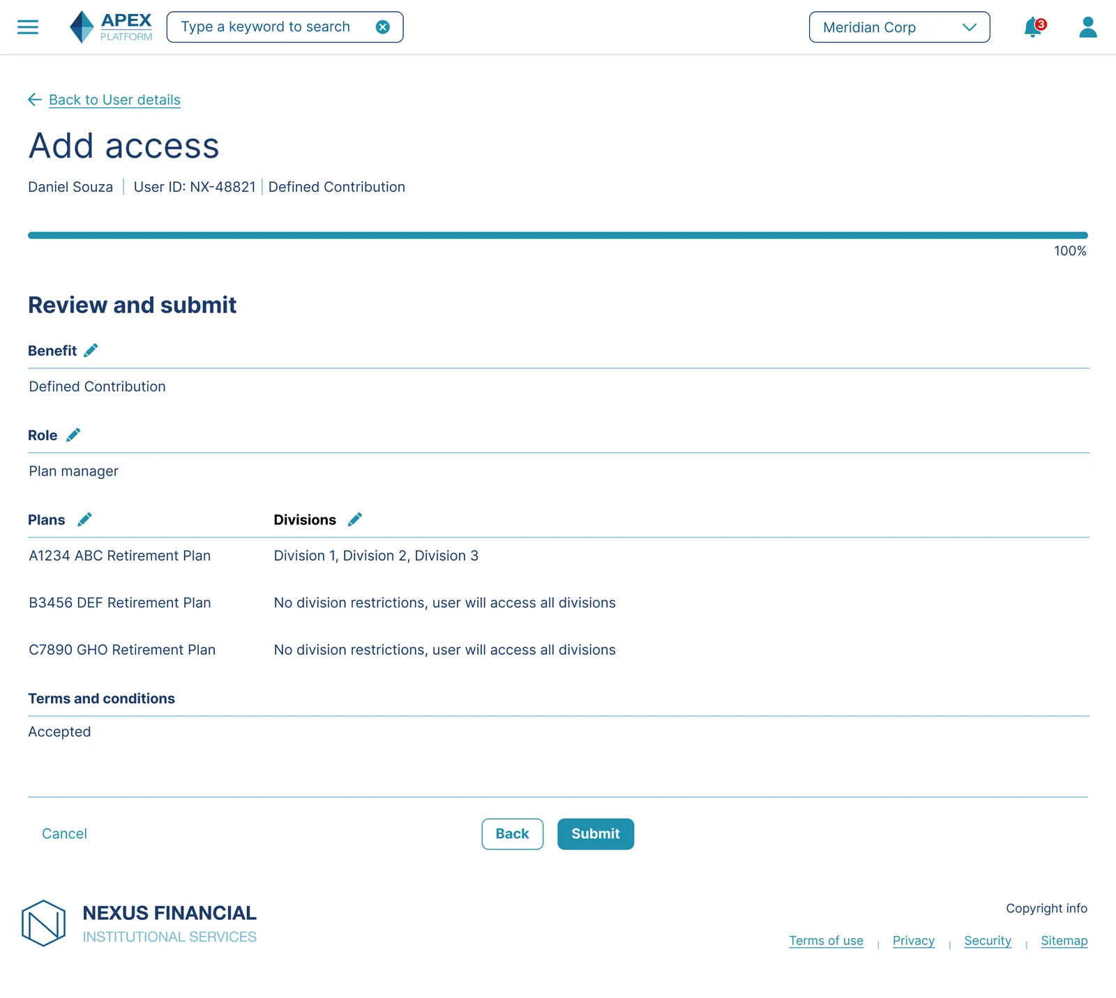
Don't Submit Without Confirmation in a Compliance Context: Given the audit requirements behind this flow, allowing direct submission from any earlier step without a final review would have been a real compliance risk.
Peak-End Rule: The final screen in any flow disproportionately shapes how the whole experience is remembered. A clear, error-free review and submission step was designed to be the strongest moment in the journey, not an afterthought.
Zeigarnik Effect: The persistent progress bar reaching 100% at this step, after being visible throughout, gives a strong sense of closure that an unindicated multi-step form would lack.
Stock Plan Services: a divergent flow, a consistent experience
Stock Plan Services required divisions to be selected before plans, the reverse of every other benefit. The wizard shell stays identical, the same progress bar, the same step structure, but the content inside the division step changes to reflect SPS's text-entry input pattern rather than a checkbox list.
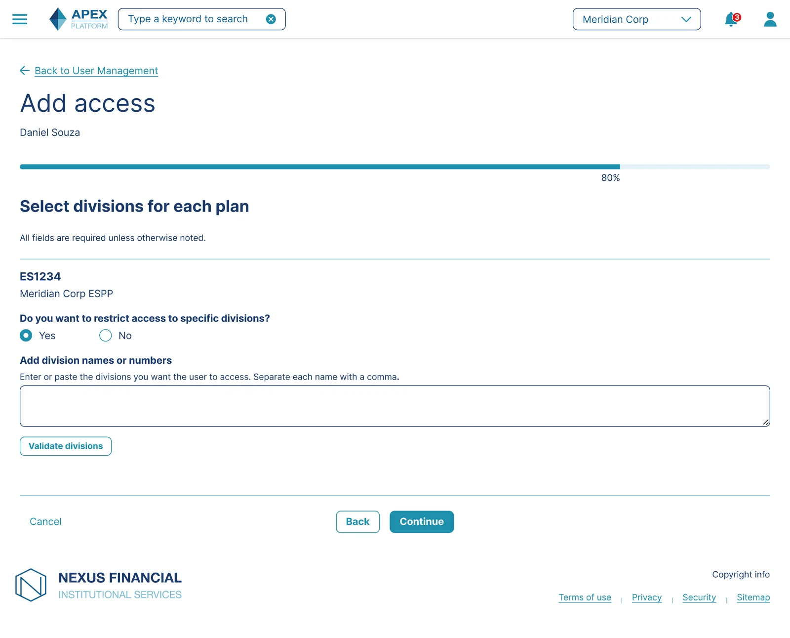
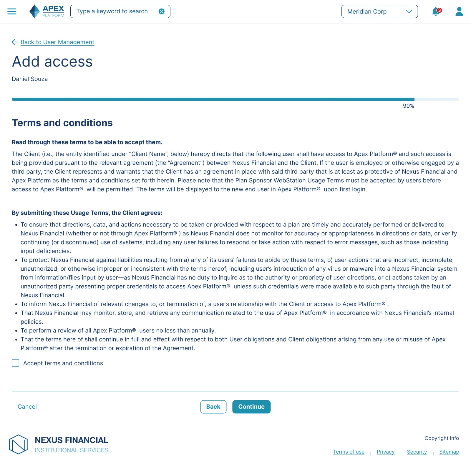
Don't Expose Backend Inconsistency to the User: The SPS division-before-plans sequence is a backend constraint, not a user-facing concept. The wizard absorbs the difference without asking the administrator to understand why the order changed.
Consistency and Standards: By keeping the wizard shell identical across both DC and SPS flows, administrators who have completed the DC flow can approach SPS with a reliable mental model of what to expect, even though the underlying logic is different.
Access review lifecycle
Beyond provisioning, administrators are required to periodically review and certify that all users have the correct level of access. I designed two screens that close the loop on the full access management lifecycle.
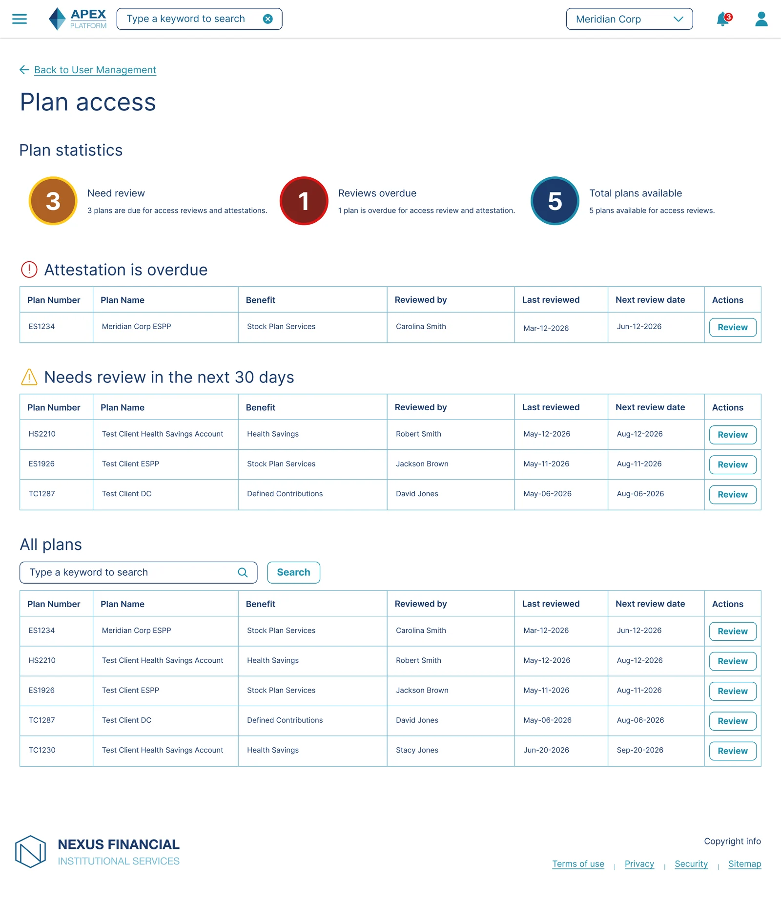
The Plan Review dashboard gives administrators a high-level view of all plans, with clear status indicators for plans due for review, plans overdue, and plans with upcoming review dates. Clicking into a plan takes the administrator to the Attestation screen.
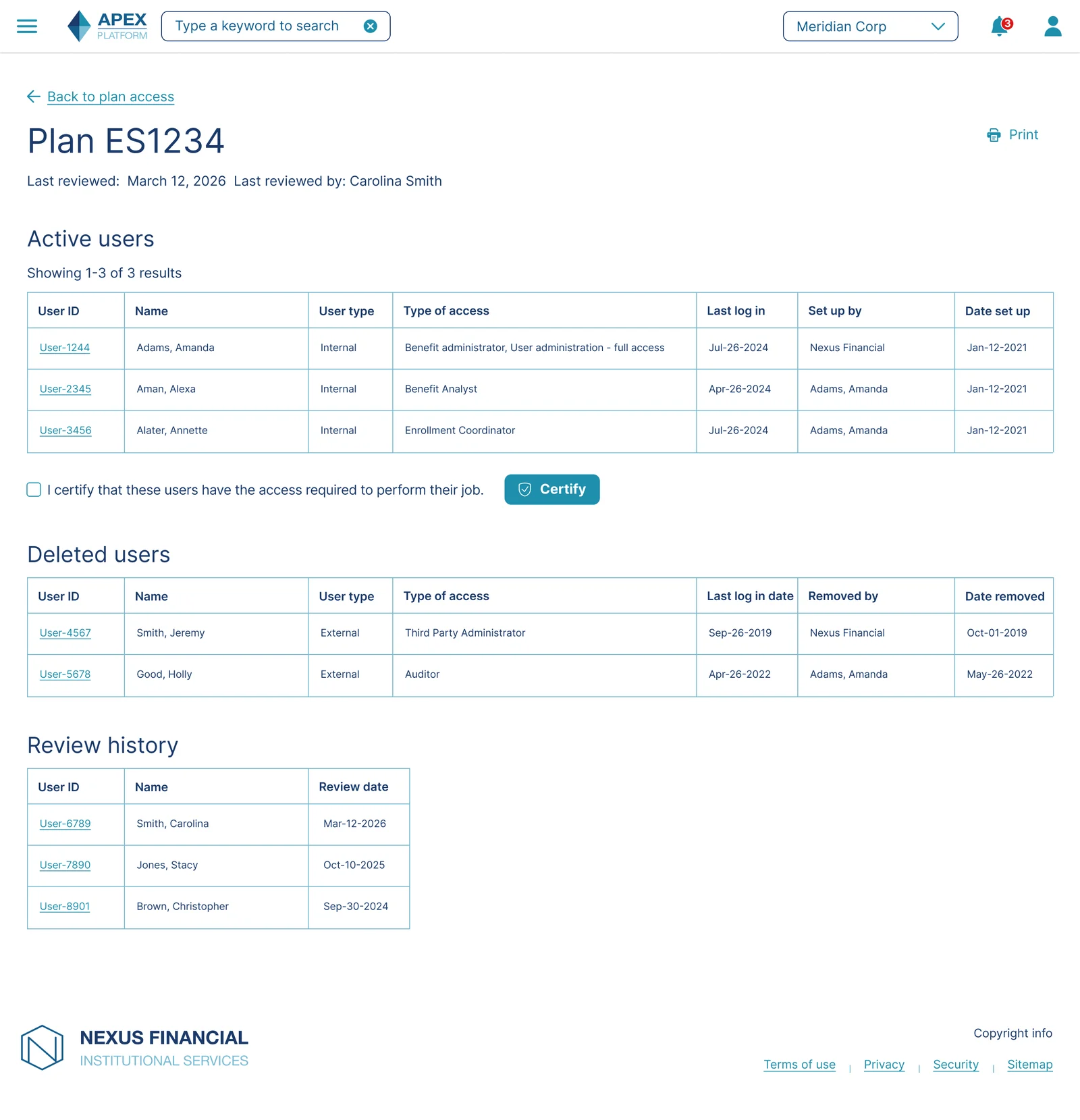
The Attestation screen lists every active user on the plan with their access type, presents a clear certification action, and maintains a full review history. The compliance requirement, reviewing access no less than annually, is built directly into the UI rather than managed outside the platform.
Don't Separate Compliance Tasks from the Core Workflow: Rather than managing access review through a separate report or email process, the review and attestation screens live inside the same platform administrators use to provision access, keeping the full lifecycle in one place.
Closing the Loop: The Attestation screen's review history and certification action give administrators a clear sense of completion for each plan, reinforcing the ongoing nature of access management as a cycle rather than a one-time task.
Business impact
- Cut provisioning from days to minutes. Before this platform, adding a new user was a paper process. A form was submitted, data feeds were uploaded, a staff member keyed the information in by hand, and access switches were turned on one at a time. End to end, that took 5 to 7 days. Measured against real provisioning data after launch, the same task through the wizard takes minutes.
- Enabled self-service provisioning. The new wizard gave clients a fully self-service path for setting up user access, available directly inside the platform.
- Lowered support burden. Embedding role descriptions directly into the selection step gave administrators the context they needed to make confident role choices within the flow itself.
- Built for scale beyond MVP. Designing the wizard shell to be sequence-agnostic, capable of absorbing the SPS benefit's reversed division-then-plan logic, meant the same structure could extend to additional benefits and more complex client configurations without a ground-up redesign.
- Validated through direct testing. Usability testing with 7 administrators confirmed the core interaction patterns, plain-language role descriptions and the edit-from-review pattern, worked as designed. The same testing surfaced one refinement, an explicit "no restriction" label, that resolved hesitation for the 3 of 7 participants who encountered it on the platform's most complex step.
Closing
Winning moments
- Designed a single wizard structure that absorbed two genuinely different backend sequences without exposing that difference to the user
- Maintained visual and interaction consistency across multiple platform-wide design system changes
- Embedded compliance-critical context, role descriptions, and terms acceptance directly into the flow rather than relying on external documentation
Lessons learned
- Usability testing on the division step confirmed that even a well-reasoned interaction pattern can leave an ambiguous gap. A confirmed "no restriction" state needed to be just as explicit as a restricted one.
- Designing for an MVP with a deliberately narrow technical scope required building in headroom for complexity that was not yet in scope, rather than designing only for the case in front of me.
- A consistent shell with adaptive internal logic is a more durable pattern than branching flows with hidden steps, since predictability matters more than minimalism in compliance-sensitive enterprise tools.