Designing a collections experience that felt like support, not interrogation
Snapshot
A debt-collection tool has to stay compliant and legally precise while never making an already-stressed customer feel cornered. That tension, between the bank's need for accurate financial disclosure and the customer's need to feel supported, was the design problem at the heart of this project. The Collections Web Application launched in the UK in January 2018 and was subsequently adopted across three further regions, APAC, MENA, and the US, becoming part of HSBC's shared global collections infrastructure.
| What | Detail |
|---|---|
| Product | Collections Web Application: an income and expenditure tool for customers managing overdue accounts |
| My scope | UX and UI designer, responsible for the interaction and visual design across the overdue accounts dashboard, segmented I&E form, and promise-to-pay flow, working closely with research throughout |
| Collaborator | Emma Martin, research collaboration and support throughout the project |
| Outcome | UK launch January 2018, followed by global adoption across APAC, MENA, and the US |
Context
The product
The Collections Web Application was built for HSBC's contact center agents and, in some markets, directly for customers managing overdue accounts. At its core was an Income and Expenditure form: a structured financial disclosure tool that let customers share a full picture of their incomings and outgoings so the bank could offer realistic repayment plans rather than default demands. The product also included an overdue accounts dashboard and a promise-to-pay flow.
The users
Customers arriving at this product were often stressed, time-pressed, and wary of institutional processes. A form that felt clinical or overwhelming would cause drop-off at exactly the moment the bank most needed engagement. Contact center agents using the tool needed to move through it efficiently on behalf of customers while still capturing complete and accurate data.
Key constraints
- All visual design had to work within HSBC's Personal Banking Digital Styleguide, which left limited room for tonal flexibility.
- The product was scoped for UK launch but designed from the start to support global rollout, meaning the interaction model had to hold across different regulatory contexts and customer service norms.
- The I&E form required capturing detailed financial data across multiple categories without overwhelming users who were already in a high-stress situation.
Key challenge
A financial disclosure form is inherently friction-heavy. Customers are being asked to expose the full detail of their financial lives at a moment of vulnerability. The design challenge was not just usability. It was trust.
There was no clean resolution to that tension at the surface level. The form would always be long. The questions would always feel personal. The design opportunity was to remove every source of friction that was not essential to the task itself, and to use tone, structure, and visual language to signal to the user that the product was on their side.
Research
This product was not designed on instinct. It was shaped by a sustained program of user research run with Foolproof, with research collaboration and support from Emma Martin, across multiple rounds of lab-based testing between 2017 and 2018. Each round put prototypes in front of real HSBC customers who had genuinely missed payments and entered collections, and each round fed directly into the next iteration of the design.
The final round, in February 2018, ran eight 45-minute one-to-one lab sessions in London with customers who were repeat entrants to collections, testing the income and expenditure form on desktop and the Promise to Pay flow on mobile.
The insight that anchored every design decision
The most important finding was not about a button or a label. It was emotional. Across rounds, participants described embarrassment and worry that grew as their debt situation worsened, and crucially, that embarrassment actively reduced their willingness to contact the bank at all. People were avoiding the very help that could resolve their situation, because reaching out felt exposing.
This is the finding that justified the entire design stance. Every later decision, the segmented form, the warmer tone, the three-path action model, the plain-language lockout screens, the debt-advice prompt, traces back to this: the product had to lower the emotional cost of engaging, not just the functional cost.
In their own words
Real participant quotes from the research, attributed as they appear in the debrief decks, made the emotional stakes impossible to design around.
"I was embarrassed. I wanted to ignore the letters from the bank."
Female, 29, Teacher
"It's a worrying feeling. You want to be keeping your head above water."
Male, 24, Sales advisor
"I'd want to be at home because I have to collect the documents."
Male, 50, Consultant
"This page is a good thing to have, it's like an alert."
Female, 46, Office manager
What the research changed
The findings drove specific, traceable design decisions:
- Embarrassment suppressed help-seeking, which justified treating tone, warmth, and plain language as core design material.
- Customers found the full form overwhelming, which drove the segmented, category-by-category structure.
- The debt-advice prompt was welcomed, positioning the bank as helpful, which validated keeping the free-charity-advice route in the flow.
- Customers wanted to complete this privately, at home, which reinforced the decision to make the whole experience fully self-service across devices.
Key decisions
Three decisions shaped the product's character. Each involved a real tradeoff, and each was made with the emotional context of the user as the primary lens.
Decision 01
Segmented flow over a single long form
Early concepts explored whether to present the I&E form as one continuous page or break it into shorter, category-focused steps. The single long form had the advantage of transparency: customers could see the full scope upfront. In testing, it read as overwhelming and caused avoidance behavior before users had started filling anything in.
The segmented progressive disclosure approach grouped questions by category (housing, household bills, personal expenses) and surfaced one category at a time. This reduced perceived effort at the point of entry without hiding anything from the user. The tradeoff was a longer click path, which we offset with clear step indicators and consistent labeling so users always knew how much remained.
UX Principle: Progressive DisclosureDecision 02
Tone as a deliberate design material
Typography, color, and microcopy were treated as part of the trust architecture. HSBC's brand palette skews formal and authoritative, which works for retail banking but risks feeling cold in a collections context. Working within the constraints of the Digital Styleguide, I pushed for warmer, more directive microcopy on form labels and CTAs, and avoided red as a status color wherever possible given its association with error and alarm.
The goal was a product that felt like a bank trying to help, not one building a case. Every label, every empty state, and every confirmation message was reviewed with that lens.
UX Principle: Emotional DesignDecision 03
A clear hierarchy of three paths, not one forced action
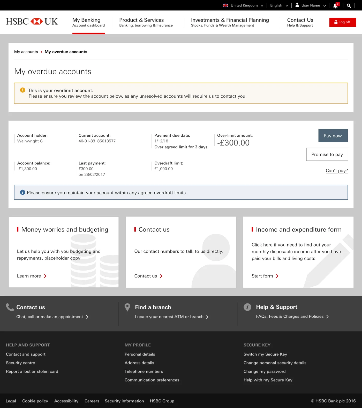
Rather than presenting a single "Pay now" CTA, the overdue accounts dashboard surfaced three distinct paths: Pay now as the primary filled action, Promise to pay as a secondary outlined action, and Can't pay as a quieter tertiary link. This gave customers agency at a moment where most institutional systems offer none, while still visually prioritizing the outcome the bank most wanted.
The "Can't pay" path was a deliberate design choice to reduce avoidance behavior. If customers feel there is no option that fits their situation, they disengage entirely. Surfacing a supported pathway for that case kept them in the system and in conversation with the bank rather than defaulting to silence. Usability testing later showed this hierarchy needed further refinement, covered in the next section.
UX Principle: Recognition Over RecallUsability validation
Alongside the discovery research that shaped the design, later rounds of the same Foolproof program put the built product through moderated usability testing, covering the full Promise to Pay journey: the overdue accounts dashboard, payment date selection, payment type, and the promise cancellation flow. These sessions produced a specific set of refinements. Some were absorbed before the UK release, others were scoped into the rollout backlog, which is the ordinary reality of testing against a fixed launch date. The screens throughout this case study show the design as participants saw it, so the findings below can be read against what was actually tested.
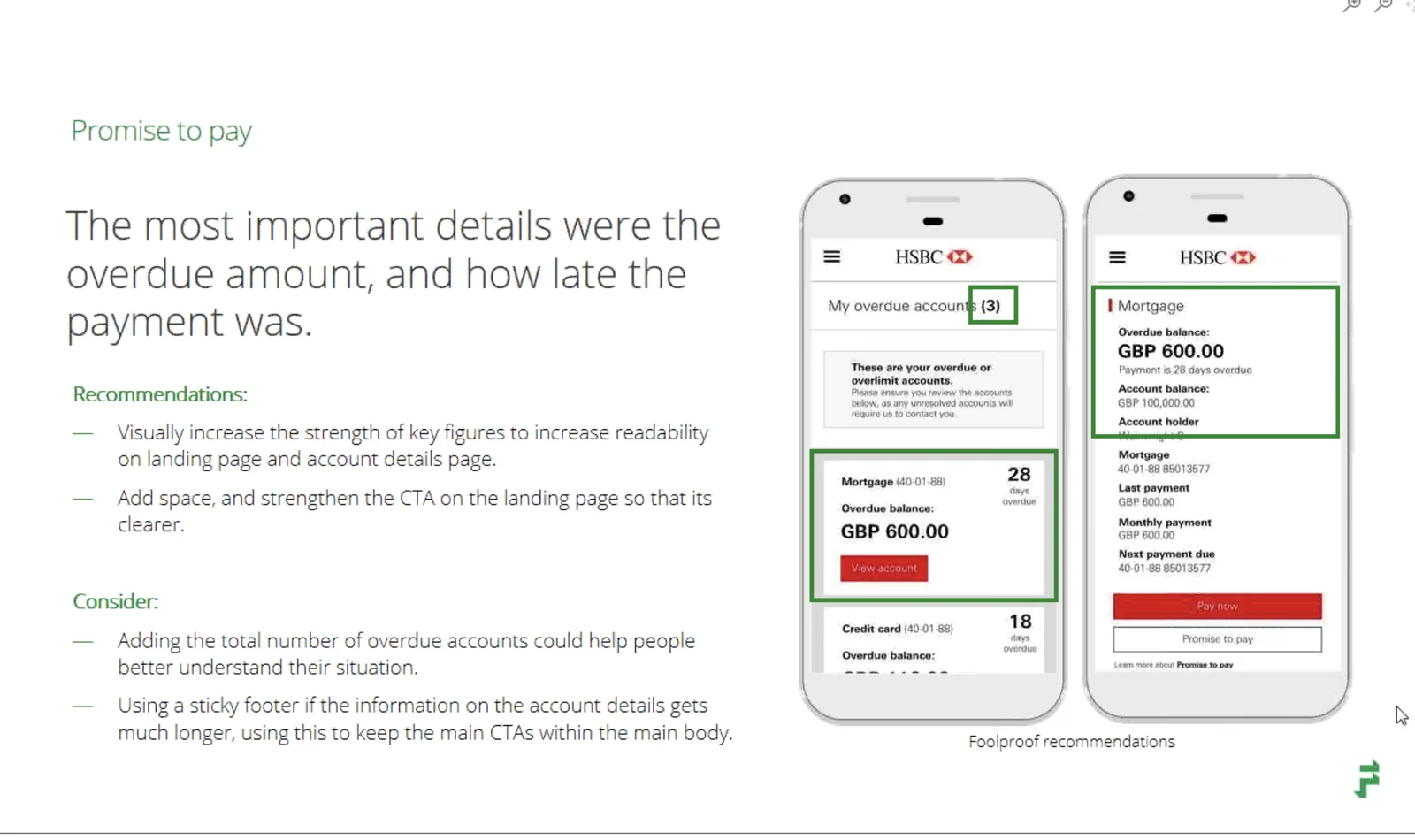
The three dashboard actions needed clearer parity
Participants understood all three options on the overdue accounts dashboard, but several noted that "Pay now," "View my promise," and "Can't pay" competed for attention unevenly once a promise already existed. The recommendation coming out of testing was direct: the three options should have equal prominence, and "View my promise" should be relabeled "View and edit promise" so customers understood they could make changes, not just look.
Weekend payment dates caused quiet confusion
When choosing a promise-to-pay date, most participants correctly worked out they could not select a date after their next contractual payment. But several raised concerns about weekend dates specifically. One participant, a teacher in his early thirties, assumed a weekend submission would still be honored on that date. Since weekend payments were not processed the same way, the recommendation was to gray out weekend dates entirely rather than leave the assumption unaddressed.
Charges needed to be concrete, not implied
Most participants moved through the payment confirmation step quickly, but several finished the journey uncertain about exact charges. A 63 year old project manager put it plainly: he wanted to know exactly what he would be charged, since "there must be standard charges." The recommendation was to state specific amounts wherever possible in the warning callouts at the start and end of the journey, rather than referencing charges in general terms.
Calling remained the instinctive fallback
Across nearly every task, participants said that if they hit real difficulty, they would call the bank rather than continue online. This wasn't a failure of the digital flow. It reflected a genuine preference for human contact at moments of financial stress, exactly the kind of user context the whole product needed to design around rather than fight. It reinforced why every step of the Promise to Pay flow kept a visible phone number and contact path rather than assuming the online journey was the only route to resolution.
The I&E form earned trust once discovered
Getting to the Income and Expenditure form on the public site proved harder than getting through it. Research showed most participants struggled to locate the form on the page, with only one scrolling to find it unprompted. The recommendation was direct: move the form's header up across the fold to encourage scrolling, and reformat the small print that was drawing the eye to the wrong place.
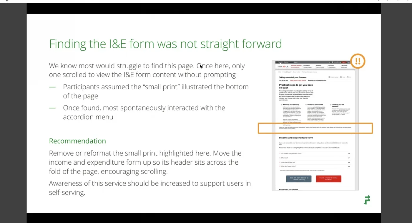
Once they found it, several participants engaged with the form more than the task required, treating it as a genuine budgeting tool rather than just a compliance exercise. A 50 year old child therapist said she'd like to use it "at the moment I do a lot of this mentally," a strong signal that the form's value extended beyond its original purpose.
Feature deep dive
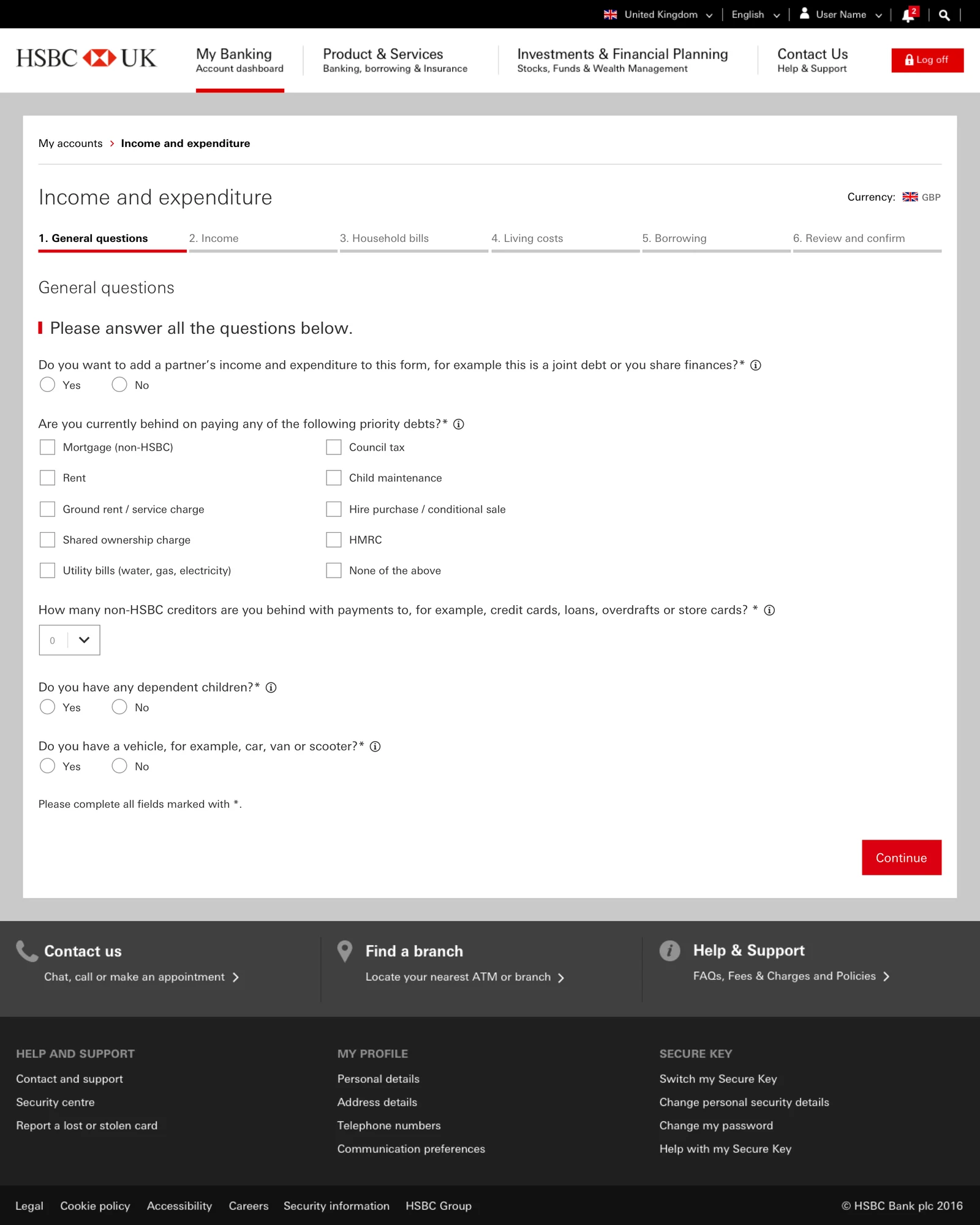
The Income and Expenditure Form
The I&E form was the product's most complex surface and the one most likely to cause drop-off if handled poorly. Each step was anchored by a single, clear category heading and surfaced only the fields relevant to that category. The user was never confronted with the full scope of the disclosure at once.
Step indicators at the top of each screen kept users oriented and made progress visible. "Continue" was the only primary action per step, reducing the cognitive overhead of deciding what to do next.
Anti-pattern avoided
A single dense financial questionnaire with no visible structure or progress signals interrogation, not support. In testing, this pattern caused users to abandon before completing the first section. The segmented approach replaced it with a category-by-category rhythm that kept users anchored throughout.
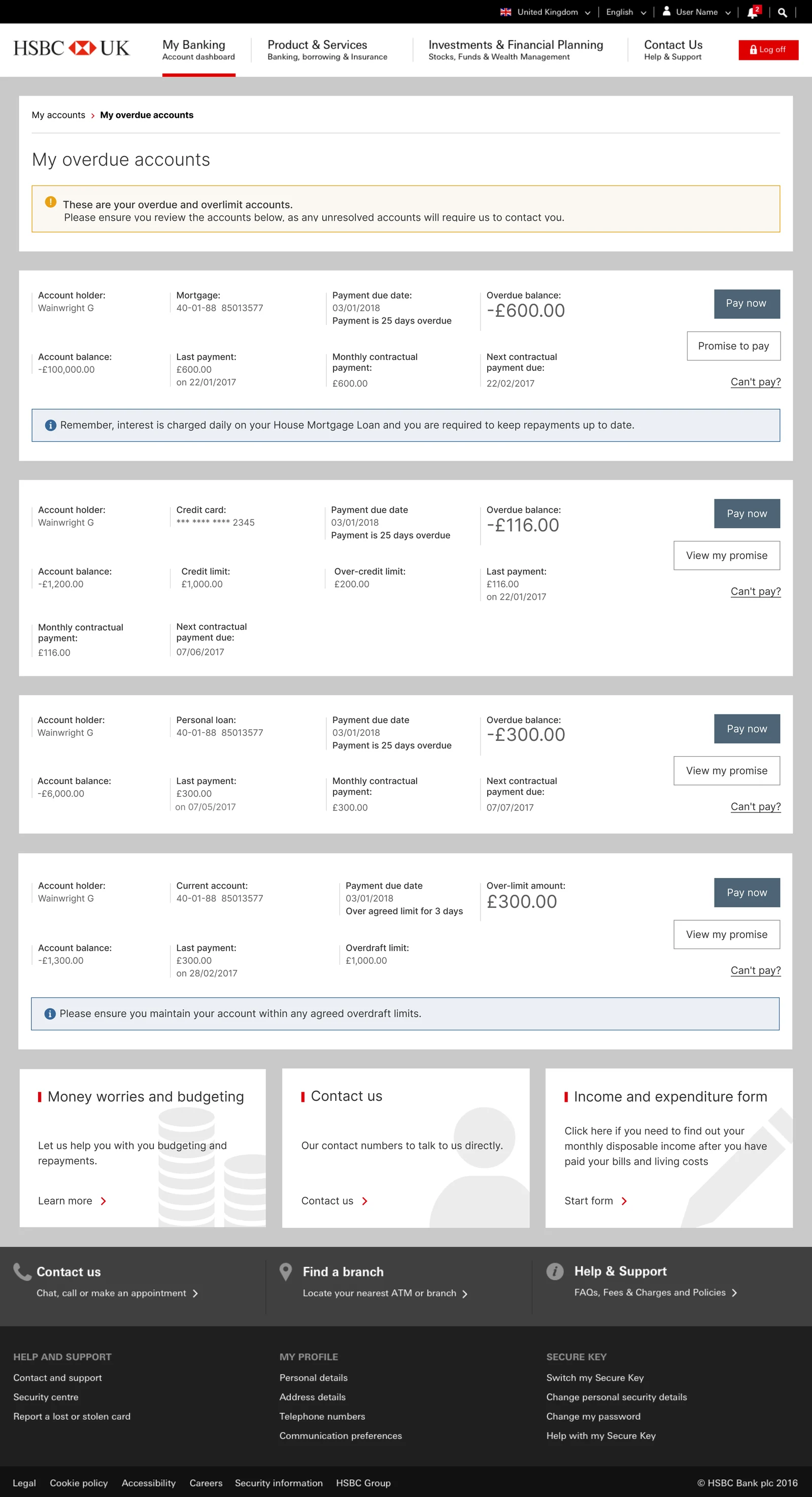
Overdue Accounts Dashboard: one action model across four account types
The dashboard was the hardest information-design problem in the product, because it had to hold four genuinely different account types on a single page, a mortgage, a credit card, a personal loan, and a current account, each with its own balance structure, its own regulatory language, and its own tone. A mortgage in arrears is not the same conversation as an overdrawn current account, and the bank is legally required to say different things about each.
Rather than design four separate layouts, I designed one consistent account card and one consistent three-path action model that could absorb all four cases. Every card leads with the customer's situation, account holder, balance, and payment history, before presenting any action. Pay now is the primary filled action, Promise to pay a secondary outlined action, and Can't pay a quieter text link: always in the same place, always in the same visual hierarchy, regardless of account type. The account-specific complexity lives in the content, not the structure, so a customer who understands one card understands all of them.
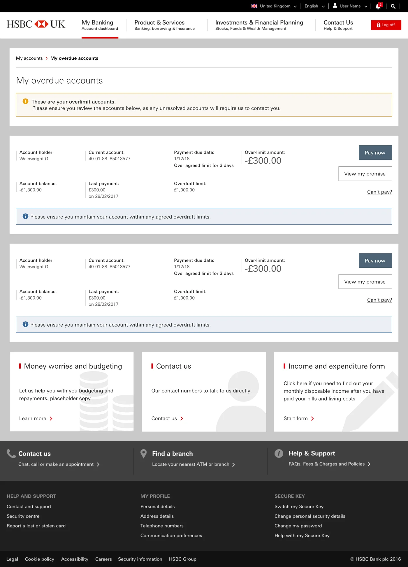
The same structure had to scale to customers with more than one account of the same type. A customer with two current accounts both over their limit sees the identical card pattern repeated, rather than a bespoke multi-account view, which keeps the mental model intact no matter how many accounts a customer is managing at once.
Systems decision
Designing one adaptable card rather than four fixed layouts meant new account types or account combinations could be added later without a redesign. In a product that shipped to four markets with different regulatory contexts, that structural consistency was what made the tool portable rather than a UK-only build.
The Promise to Pay journey: four steps to commitment, plus three business rules surfaced honestly rather than hidden behind a generic error
The Promise to Pay flow
Once a customer chose not to pay in full, the Promise to Pay flow broke a genuine financial commitment into four short steps: payment amount, payment date, payment type, and reason for the delay. Each step carried its own step indicator, consistent with the pattern established in the I&E form, so the two flows felt like one coherent product rather than separate tools bolted together.
The payment date step enforced a hard business rule (no date beyond the next contractual payment) directly in the calendar UI rather than through an error message after the fact, preventing an entire class of invalid submissions before they could happen.
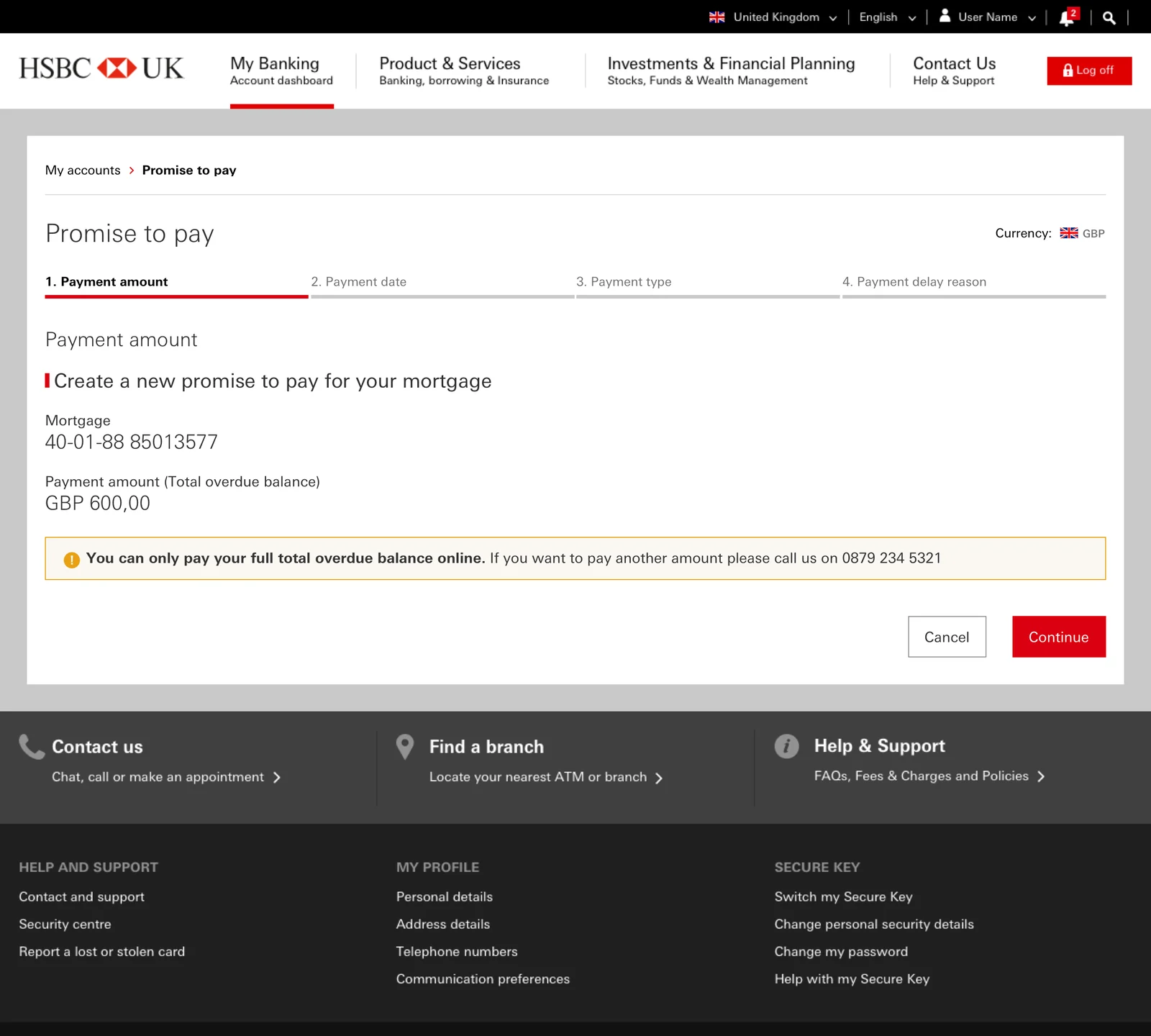
UX principle applied
Peak-End Rule: people judge an experience largely based on how it felt at its most intense point and at its end. The final confirmation screen was written as a plain-language summary rather than a legal notice, so the moment of commitment felt resolved rather than contractual.
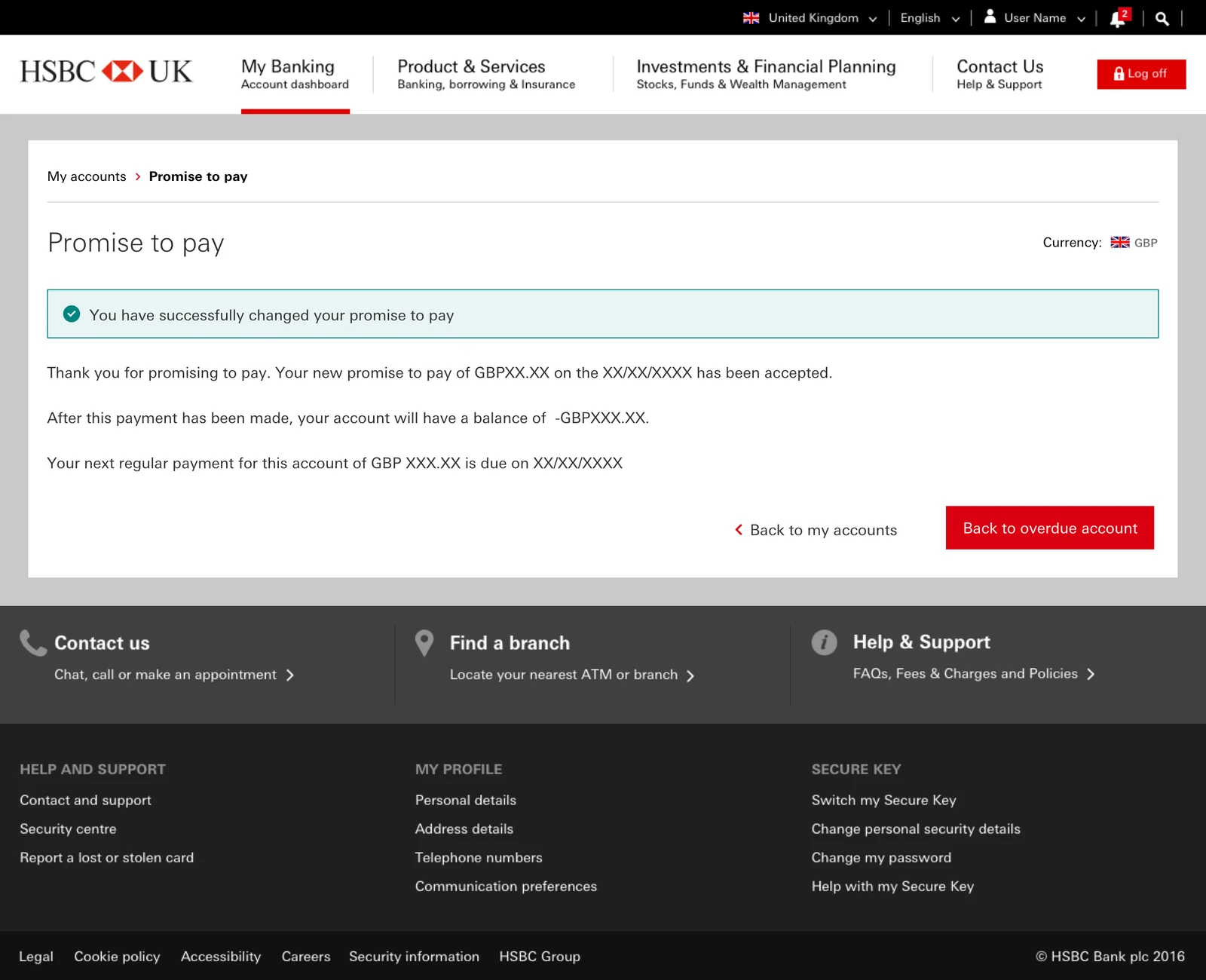
Designing for the edges: editing, canceling, and repeat missed promises
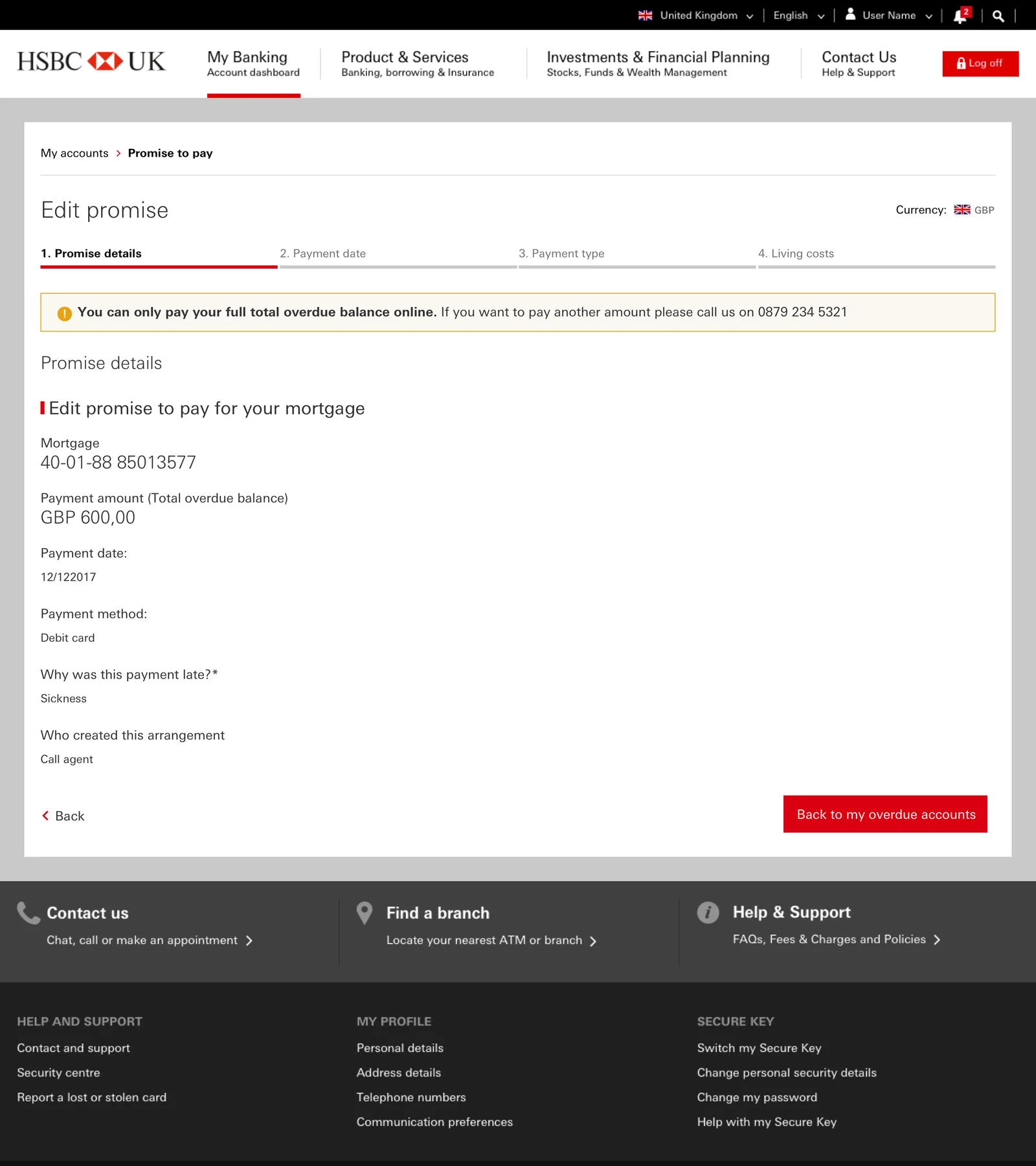
A meaningful part of this feature's complexity lived in what happens after the happy path. Three business rules had to be surfaced honestly in the UI rather than hidden behind a generic error: a promise cannot be edited online within four days of its due date, a promise created by phone or by an agent must also be changed by phone, and a customer who has broken a promise in the last 30 days cannot create a new one online.
Rather than a dead end, each of these states explained the rule in plain language and gave the customer a clear next step, usually a phone number, so the restriction felt like a policy being explained rather than a system refusing to cooperate.
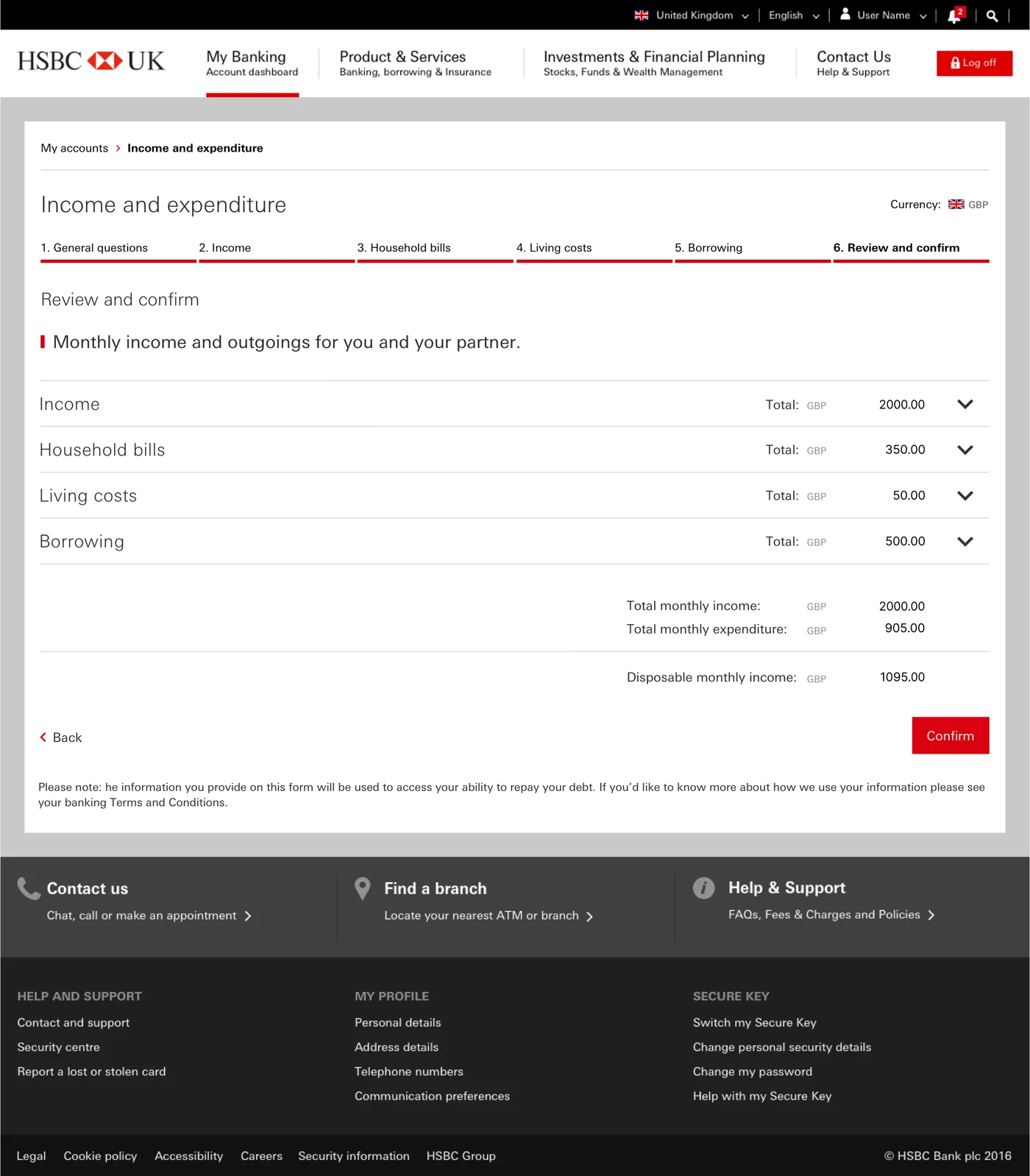
Review and Confirm: a summary that expands, not a wall that overwhelms
The Income and Expenditure form ends at a Review and Confirm step, and this was where the compliance-versus-emotional-safety tension was sharpest. Legally, the customer has to see and confirm every figure they entered across income, household bills, living costs, and borrowing, potentially over a hundred line items. Emotionally, hitting a stressed customer with a hundred numbers at once is exactly the kind of moment that causes abandonment at the finish line.
I explored two directions. The first showed everything expanded at once: fully transparent, but overwhelming, and it buried the one number that actually matters, the disposable monthly income figure that determines what repayment is realistic. The second, which shipped, opened in a collapsed state showing just the five category totals and the disposable income calculation, with each category expandable on demand. The customer sees the shape of their finances first, confirms the summary they can actually reason about, and drills into any category only if they want to check the detail. Nothing is hidden, but nothing is forced either.
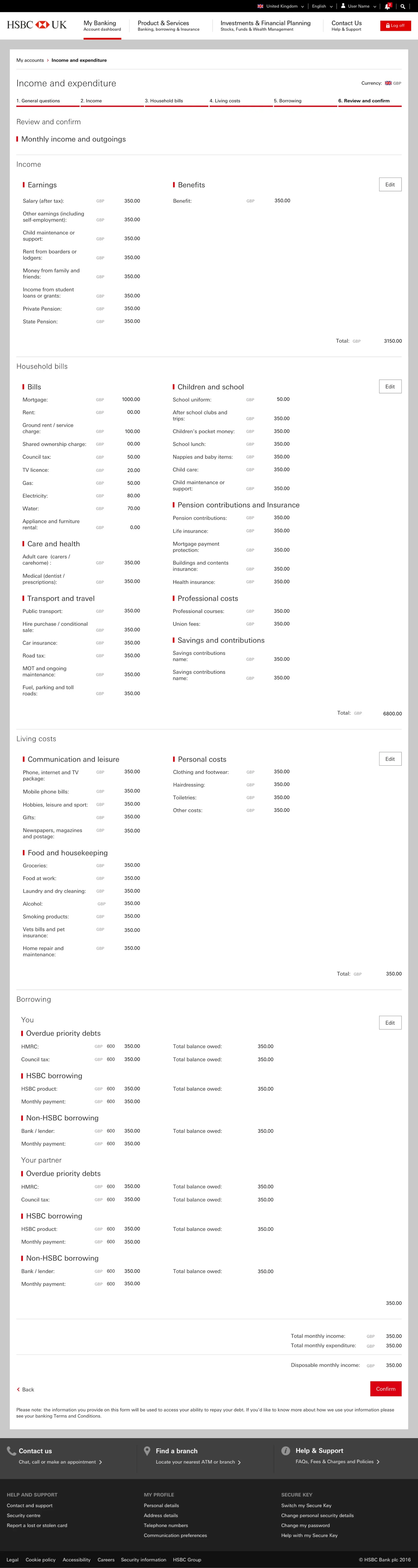
UX principle applied
Progressive disclosure at the confirmation step: the legal requirement to show every figure and the human need to not be overwhelmed are not actually in conflict, as long as the detail is available rather than absent. Collapsing to totals by default satisfies both, and it keeps the single most decision-relevant number, disposable income, as the visual focus.
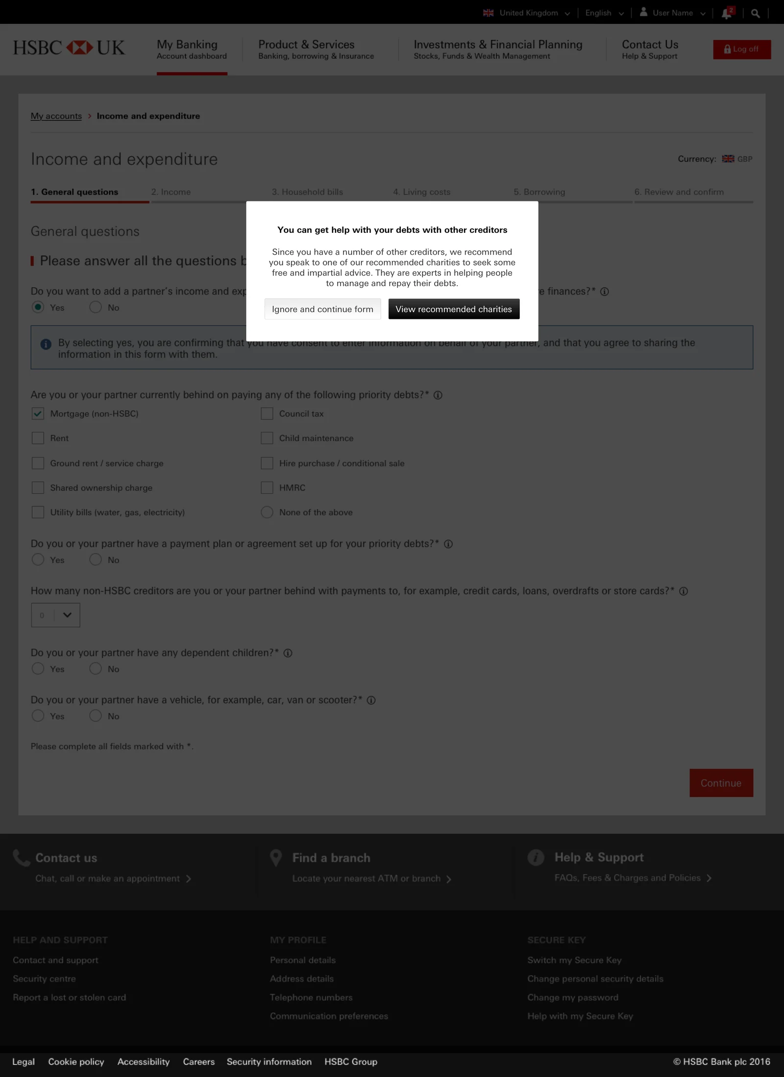
A duty-of-care moment: routing customers to free debt advice
One decision sat slightly outside the core flow but mattered more than almost anything else in it. When a customer indicated they had multiple other creditors, a point at which their situation is likely serious, the form surfaced a prompt offering free, impartial debt advice from independent charities, with the option to continue the form or step out to get help first.
Commercially, routing a customer away from your own repayment flow toward external advice is counterintuitive. But for a bank in a collections context, it is both the right thing to do and, in the UK, part of the regulatory duty of care around customers in financial difficulty. Designing this moment to feel like genuine support rather than a legal box-tick was one of the clearest expressions of the whole product's stance: on the customer's side, even when that means pointing them elsewhere.
Accessibility
Given the product's role in a financially sensitive, sometimes vulnerable customer journey, accessibility wasn't treated as a compliance checkbox. The full desktop experience underwent an independent WCAG 2.0 accessibility review conducted by AbilityNet, which identified 3 high priority, 14 medium priority, and 8 low priority issues across the reviewed pages, spanning labeling, color use, error identification, and screen reader navigation.
Findings such as inconsistent alt text on logos, unclear error message association with form fields, and color-dependent status indicators were fed back into subsequent design iterations. In a product where the user may already be under financial stress, a barrier caused by an accessibility gap is not a minor inconvenience, it's another point of friction actively working against the product's purpose.
Business impact
The Collections Web Application launched in the UK in January 2018 and was subsequently adopted across APAC, MENA, and the US, becoming part of HSBC's shared global collections infrastructure rather than a single-market tool.
In a highly regulated, risk-averse institution like HSBC, global rollout is not a default outcome. It requires demonstrated stability, regulatory compliance across multiple frameworks, and enough stakeholder confidence in each market to commit to adoption. The design was backed by evidence at every stage: multiple rounds of user research shaped the core interaction model, an independent audit surfaced 25 accessibility issues across three priority levels that were fed back into the design, and pre-launch usability testing drove concrete refinements to the dashboard, the promise-to-pay dates, and the form's guidance before wider rollout. The fact that a tool designed for one market became part of HSBC's shared global infrastructure speaks to the soundness of the underlying interaction model.
| Market | Status | Notes |
|---|---|---|
| United Kingdom | Launch market | January 2018 initial release |
| APAC | Adopted | Global rollout following UK launch |
| MENA | Adopted | Global rollout following UK launch |
| United States | Adopted | Global rollout following UK launch |
Product Manager, Global Collections
Reflection
The strongest part of this project was also the hardest to hold onto: keeping the emotional context of the user at the center when the business, regulatory, and technical requirements all pulled toward a colder, more transactional product. The research made the case unarguable, but translating "customers feel embarrassed and avoid contact" into specific tone, hierarchy, and microcopy decisions was a constant negotiation against a brand system built for confidence, not vulnerability.
If I were doing it again, I would push to close the loop with post-launch data. We had rich qualitative research going in and strong usability validation before release, but I never got to see how the shipped product performed against the behavior the research predicted: did the segmented form actually reduce drop-off, did the three-path model change how many customers engaged rather than went silent? Designing the measurement plan alongside the product, so the emotional-safety thesis could be proven quantitatively after launch, is the piece I would build in from the start next time.